Despite putting in a lot of effort to create a visually appealing and well-designed website, you may have noticed that visitors are coming and going without engaging with your site. If you’re unsure of the reasons why this is happening, this blog post is for you.
Listed below are the 10 most common reasons for the high bounce rate of your website with solutions to turn things around!
What does the term Bounce Rate mean?
According to Google, bounce rate is defined as the percentage of single pageview visits to a website. That description however is a little inaccurate. The actual definition can be understood by looking at Google Analytics, where the bounce rate is actually the percentage of visits to a website where the user only had a single interaction. While pageviews are often the most common second interaction on most websites, there are other types of interactions such as events and transactions that can also affect the bounce rate.
Overall your website’s bounce rate is a good indicator of how many visitors out of the total number of visitors on your site are actually interacting with it.
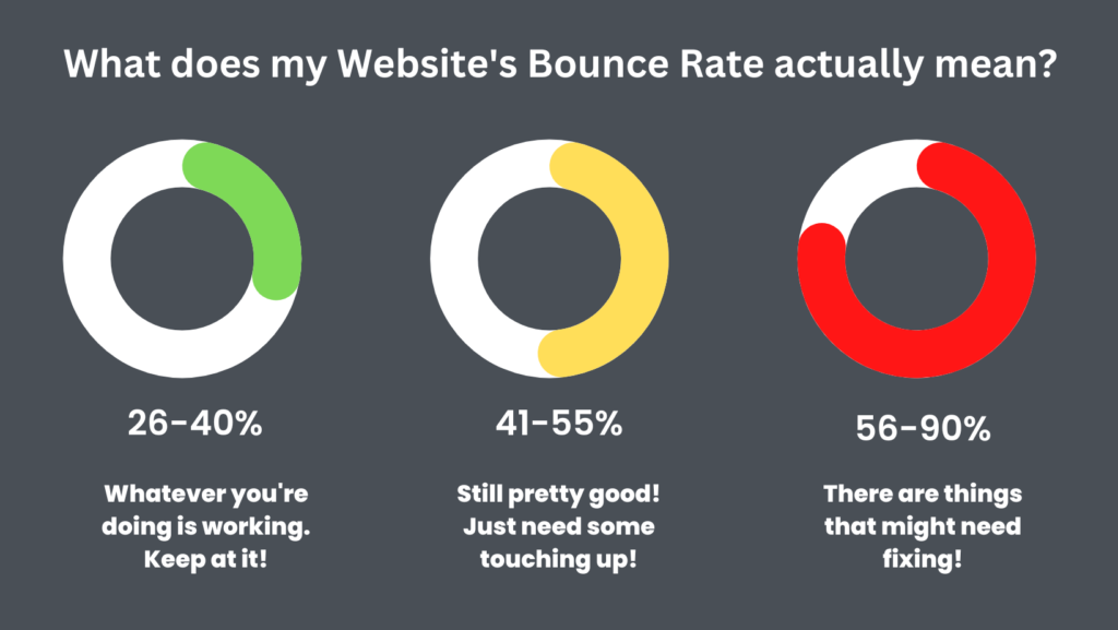
How much should my website bounce rate be?
As a general guideline, a bounce rate between 26-40% is considered excellent, 41-55% is considered average, and 56-70% is considered higher than average, but may not be a concern depending on the type of website. A bounce rate over 70% is generally considered poor unless the website is a blog, news site, or events calendar. Here’s a layman’s overview of what these stats mean for your website:

10 Reasons Visitors Leave Your Website
Now that we have a fair understanding of your website’s bounce rate, here are some reasons why it might be too high.
1. Never-ending Pop-ups
Pop-ups can have both positive and negative effects on a website. If used excessively or displayed too early in the user’s visit, pop-ups can drive visitors away from the site.
To maximize the effectiveness of pop-ups, it is important to limit their usage to ones that have been proven to have a positive impact and to make sure that they can be easily dismissed. It is also recommended to configure certain pop-ups not to display for repeat visitors.
One type of pop-up that can be useful in keeping visitors on the site is the “exit intent” pop-up. This type of pop-up can be implemented with a plugin and can detect when a visitor is about to leave the site and display a message to try and keep them from leaving.
2. Slow Loading Site
When a website takes too long to load, visitors may become frustrated and leave to find the information they need elsewhere. This can be detrimental to a business, as these visitors may turn to a competitor’s site instead.
It is important for a website to load quickly in order to keep visitors engaged and prevent them from leaving. A slow-loading website can be a major inconvenience for users and may cause them to seek out alternative options.
One potential cause of slow website loading times is the use of large images. To improve load times, it is important to ensure that all images are properly sized and scaled.
There are also several other techniques that can be used to speed up a website, such as reducing the number of scripts, compressing HTML files, minimizing server requests, and enabling browser caching. These measures can help to improve the user experience and keep visitors from leaving the site. Additionally, a faster website can also have a positive impact on search engine optimization (SEO).
3. Your website isn’t secured
Security is an important concern for many internet users, and they may be more likely to leave a website if they do not feel that their information is secure.
One way to increase security and improve the user experience is to install an SSL certificate, which encrypts communication between the browser and the website. This is especially important if the website collects personal information or processes online payments.
By taking steps to ensure the security of the site, website owners can increase user trust and reduce the likelihood of visitors leaving due to security concerns.
4. Lack of Mobile Optimization
It is important for a website to be mobile-friendly, as a large portion of internet users access the web using smartphones and tablets. If a website is not optimized for mobile devices, it may not display or function properly, leading many visitors to leave the site.
Implementing responsive design is a good practice for website design as it ensures that the content is properly displayed on screens of different sizes. For websites built using WordPress, there are themes available that are designed specifically to make content more accessible on mobile devices, such as the Responsive theme.
5. Unattractive Webpage Design
About 66% of users are more likely to stay on a website if it is visually appealing. The organization of the content on the site is also important, as it should be clear and convey the purpose of the business.
Using a clean and user-friendly website template and design, as well as the right font size and style, can help make the site more attractive. Visuals, graphics, and colour palettes can also be used to enhance the appeal of the website.
It is crucial to make sure that the layout of the landing pages is easy to use and navigate, and that all necessary information is presented in an organized and accessible manner.
6. Your Website Auto-Plays Audio or Video
Auto-playing media can be very off-putting to users, making it difficult for them to engage with your website. This can be particularly true for new visitors, who may be deterred by slow-loading videos or audio that starts automatically.
Even long-time customers may be annoyed by the experience of being force-fed the same information every time they visit. To avoid these issues, it is best to avoid auto-playing media altogether, or at least to wait until the user has had a chance to engage with some of your content before starting it.
A better option would be to make the content available in a more straightforward way, allowing users to consume it at their own convenience.
7. Difficult Site Navigation
It doesn’t take many clicks for a user to become frustrated with a website and leave. If your site is hard to navigate, users may have difficulty finding what they are looking for and will eventually give up and go elsewhere.
To avoid this problem, it is important to make the content that users are most likely to want to access highly available. For example, if you run an online store, shipping information should be easy to find. Similarly, businesses with a large product line should have menus that are easy to use and properly categorize offerings to prevent confusion and frustration.
8. Missing Contact info
It is easy to overlook something as basic as your company’s contact information when designing a website, but this can have serious consequences. 44% of website visitors will leave a site if they cannot find contact information or a contact form within the first 3 seconds of arriving on the main landing page. This can lead to a higher site exit rate and result in the loss of potential customers. It is important to ensure that your contact information is easily accessible on your website.
9. Targeting the Wrong Audience
If you are seeing a high number of people visiting your website and then quickly leaving, it could be because your marketing efforts are not reaching the right audience.
Failing to target your audience can contribute to a high bounce rate if it is not done accurately. It is important to carefully consider who your audience is and how to reach them in order to maximize the effectiveness of your marketing efforts.
Your promotional ads and backlinks should be targeted towards your ideal customer, whether through social media, backlinks, paid ads, or other channels.
10. Your CTAs need better implementation
A well-placed CTA can significantly increase sales, but it is important to position and phrase it correctly. CTAs are often used to encourage people to take specific actions, such as subscribing to a newsletter, making a purchase, or contacting the company. When adding CTAs to your site, it is important to keep them simple and clear.
Reduce your Site’s Bounce Rate with the help of our Web Experts!
We simplify the boring and complicated here at Brace Media. Improve site traffic and lead generation by reducing your website’s bounce rate with the help of Web and UX experts. Contact us today!
Related Posts
August 9, 2023
What is PPC Marketing? Answered with Pros and Cons
What is Pay-Per-Click Marketing or advertising? We answer that and more with…
August 1, 2023
Featured Snippets on Google: How Do They Work and why should you care?
What are Featured Snippets and how can they improve your website's search…
July 19, 2023
Here’s Why Off-Page SEO Is Just as Important as SEO on Your Landing Page
Discover why off-page SEO is just as crucial as on-page optimization. Learn how…


